I've subconsciously developed a love for fonts! I guess this is the influence Visual Communication & Design has on certain people.. Visual Communication is pretty self-explanatory, communication through visual aids, images with messages, a form of art. & I love it!
The infomation text was meant to be placed in the center, with the typeface W positioned at the right corner. The use of isolation text is used in this page, for a clean and sophisticated layout, the placement of garamond font W gives the viewers a deeper understanding of the designed text.
Typeface "H" symbolizes "History". The backdrop design of the font is just overlapping copied and pasted information from Wikipedia. Contrast is used in this page as well as scale with typeface H positioned in the centre.
Here is an image of the Eiffel Tower made out of various Garamond fonts. As Garamond was firstly introduced in Paris. I thought the Eiffel Tower might be a significant symbol in representing Paris. With the Eiffel Tower positioned along the right corner is just.. well.. :) Not as stereotypical.
Information of the history of Garamond is typed up and editted from Wikipedia. With the Eiffel Tower is positioned along the side contrasting from a black background. With random text placed at the top for contrast and a maximized clearer view of Garamond typeface.
A simple O gives a sense of fluidity and consistency. Simple and sophisticated
I've used pencil tool in Adobe Illustrator to outline the portrait of Claude Garamond, repositioned and scaled the numbers as an image overall, but also to introduce Garamond numbers in the book.
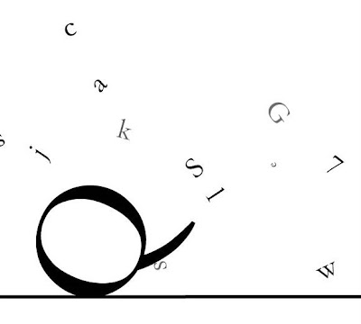
Below are the same design of text but different positioning of the lines.
See how a simple horizontal line could give the impression of falling text? And Q seemingly appearing as falling off "the cliff"
This however, is more structured and solid. Again same positioning of the text but this time, the image (as a whole) looks much more solid than the previous image. Using just a simple horizontal line.
And this... Slightly tilted diagonal line has given the image a sense of fragility. All the text appears to be falling towards the left, but with the same structure of text.
Garamond Typeface


2 comments:
LOLOL so much fonts
oh well as long as someone's happy
It is pretty smart
they should make this a class :P
Art fonts ... lol
well done :)
♥
:):)
lolol
i am indeed.
get well soon PC :d
Post a Comment